Create & Edit Dashboards
Capture dashboards are built in Grafana. In practice, you will spend most of your time doing three things:
- creating a dashboard
- adding or editing panels (the visualizations)
- refining queries and variables (the “logic” behind the visuals)
The editor you see is Grafana’s dashboard editor.
Capture provides access control, company scoping, and (optionally) Fleet/Project sharing on top of it.
Button labels and layouts may vary slightly by Grafana version.
The workflow stays the same: create → add panel → write query → apply → save.
Create a dashboard
Start by creating/searching a folder where the dashboard should be placed (middle column).
You can then add a dashboard (+ in the top right corner) in the selected folder.
- Open the dashboard you created
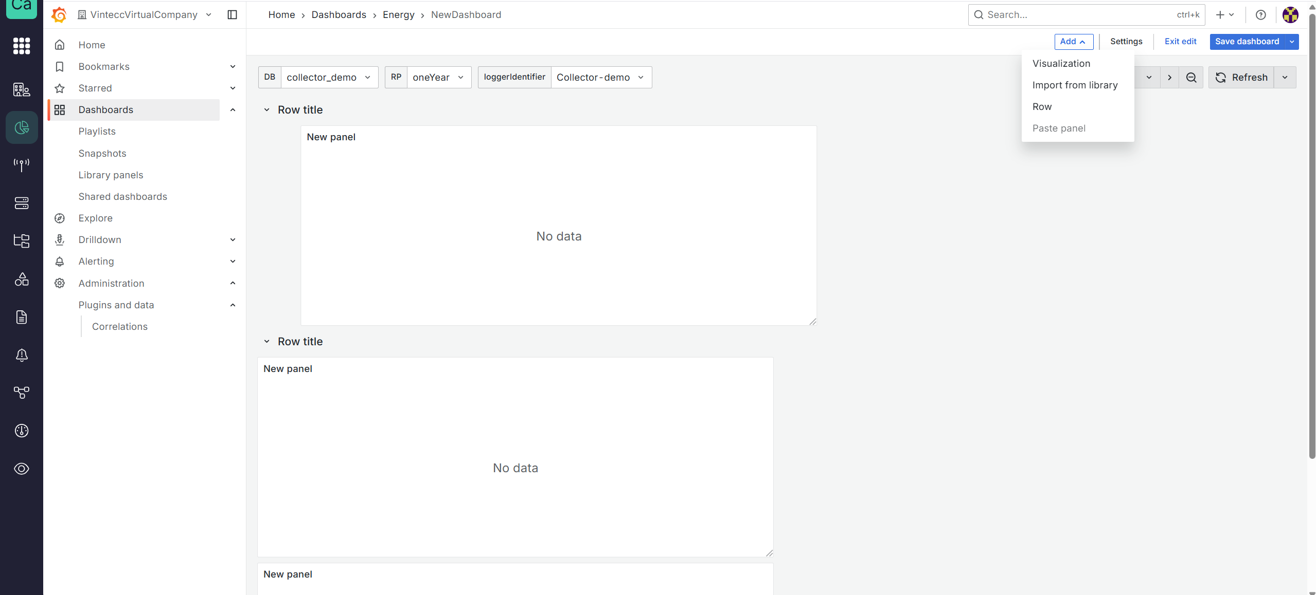
- Click
Add a visualization - Choose a data source
- Build a query (Grafana query editor)
- Click Save (top-right)
Panel changes are not persisted until you Save the dashboard.
Add a panel (to an existing dashboard)
Panels are the building blocks of dashboards: charts, stat tiles, tables, etc.
- Open an existing dashboard
- Click Add visualisation (typically in the top right when you are in 'edit' mode)
- Select a data source & write your query
- Save the dashboard
Edit a panel
- Hover the panel and click the three dots
- From the dropdown menu, select Edit
- Adjust:
- query
- visualization type
- field options (units, decimals, thresholds)
- transformations (if used)
- Click Save (top-right)
If others can view the dashboard, they will see your changes after you save.
For experiments, consider duplicating the dashboard or panel first.
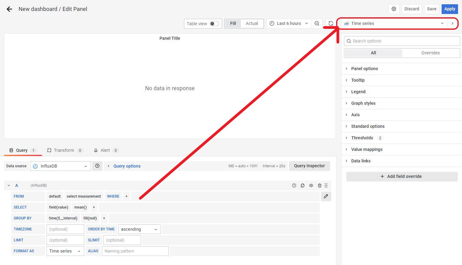
Choose a visualization type (panel type)
Each panel has a visualization type (Grafana calls this a visualization).
You can change it from the panel editor—near the top-right of the editor, below the Save area.
Grafana’s official documentation explains each visualization and its options. Use these links for details:
Core visualizations (common)
- Time series
- Bar chart
- Stat
- Gauge
- Bar gauge
- Table
- Pie chart
- State timeline
- Heatmap
- Status history
- Histogram
- Text
- Alert list
- Logs
Plugin visualizations (environment-dependent)
These are common plugins that may be enabled in your Capture environment:
Screenshots (legacy but still useful for orientation):
Best practices (performance and usability)
The following patterns improve dashboard usability and reduce load on the data source—especially for large time ranges.
Use rows to group and collapse sections
Rows help you structure dashboards into collapsible sections (for example: “Overview”, “Details”, “Diagnostics”).
Benefits:
- less clutter for users
- faster dashboards when large sections remain collapsed (depending on panel settings and data source behavior)
How to add a row:
- Click Add
- Select row
- Drag existing panels into the row
Put “must-see” KPIs above.
Put heavy charts and diagnostic panels in a row that can be collapsed.
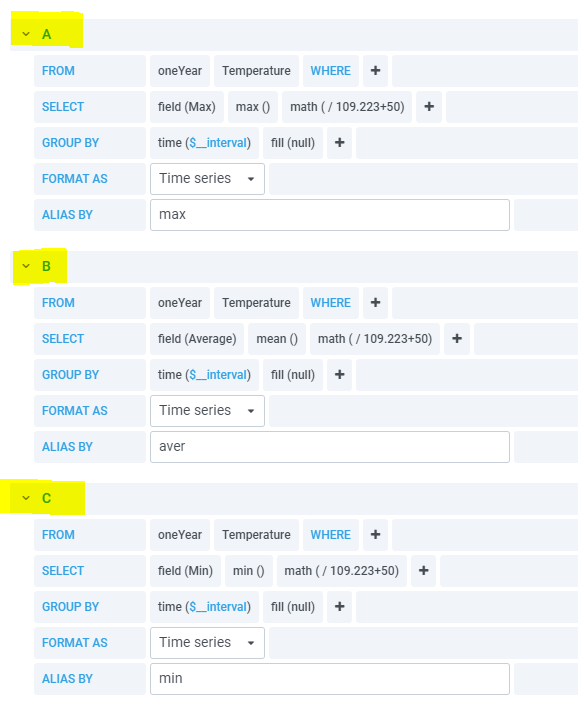
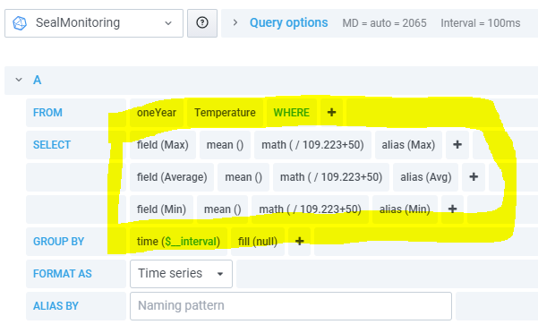
Combine multiple fields in a single query (when possible)
If multiple values come from the same measurement/series, consider retrieving them in one query instead of multiple separate queries. This can significantly reduce query overhead.
Example shown below:
- three separate queries took 29.86 seconds
- one combined query took 13.18 seconds
Performance matters, but so does maintainability.
Combine queries when it stays understandable; otherwise document intent in panel descriptions.
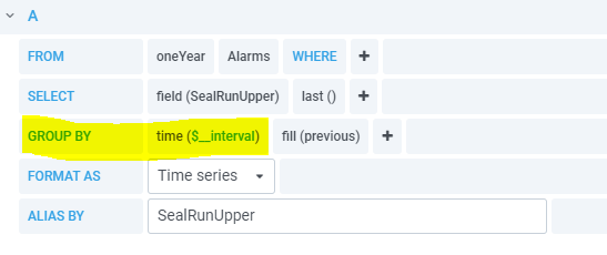
Group by time interval using $__interval
When querying a large time range, returning raw high-frequency data can overwhelm both the data source and the browser. Use time grouping to reduce the number of points rendered.
A common pattern is:
group by time($__interval)
$__interval automatically adapts to:
- the selected time range
- the panel width/density
This reduces clutter and improves performance.
If a dashboard feels slow over long time ranges, add $__interval grouping first.
Then optimize queries further only if needed.
Next steps
- View a dashboard: variables, time ranges, refresh, and “No data” troubleshooting
- Manage (Rights Management): folder/dashboard permissions and best practices for shared dashboards